Last month we launched Indoor Proximity Analytics that helps understanding users behavior using App and Bluetooth Beacons. Today, we are glad to announce Dynamic Heatmap for Indoor Location Analytics using Wi-Fi devices.
As a mobile marketer working for Shopping Malls, Smart Cities, Airports or other venue-based businesses, you need to make a lot of decisions depending on audience behavior. And on a daily basis, thousands or tens of thousands of visitors cross your venues. But how do you actually measure your footfall traffic? How do you rank the hottest areas and peak hours? And how do you get those insights easily?. To help you answer those questions in a click, we bring Dynamic Heatmaps. This feature is included in MOCA Wi-Fi Analytics, a location intelligence product capable of analyzing visitors behavior in real-time from your existing Wi-Fi network. The product also includes other cool features such as audience analytics, indoor flow analytics, floor plan management, and more.
To start with, let’s see what a heatmap is and what problem Dynamic Heatmap solves. Do you want to see Dynamic Heatmap in action? Request a free demo today.
What is a Heatmap?
A heatmap is a graphical representation of data that indicates how the visitors are distributed across a site such as an airport, a mall or even a city. The areas with highest number of visitors are condensed into "hot areas" which are represented by the red color. On the opposite, the blue color or so called “cold areas” represent locations with fewer visitors. The entire rainbow spectrum of colors is used to represent the density of visitors over the site making visual interpretation very simple.
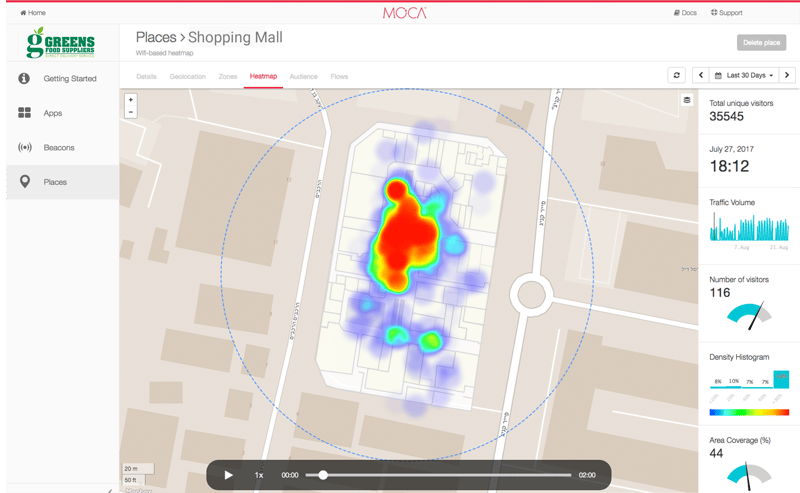
What Dynamic Heatmap tell you about your site?
This tool enables you to visualize the data collected from Wi-Fi devices installed in your site. With a single view to MOCA dashboard, you will see information such as total number of unique visitors, traffic volume, number of visitors at a specific time frame, a density histogram and area coverage that shows the percentage of area that is occupied by your visitors.
The Dynamic Heatmap enables you to observe the distribution of visitors over time. So instead of a single static snapshot, you can choose Yesterday interval, press Play button, and watch how your audience flowed, minute by minute as it shows in the video below.
Dynamic heatmap is another powerful feature for your audience analysis. It provides an immediate visual summary of the most visited areas of your sites to optimize staffing allocations accordingly and understand audience behavior in real-time.
Let us know what do you think about this exciting new feature!